A Brand Style Guide is One Essential Tool for Refreshing Your Look
By Courtney Dade, CEO, Principal, Chief Strategist
CSD Marketing and Consulting, LLC
In making a fresh start for 2021, we’ve started by refocusing on our business, its strengths and weaknesses, and the opportunities and threats to which it has been exposed. On the other side of that effort is a plan of action for moving forward—a plan for change, large or small, to put our business in position to reap the benefits of a rapidly changing environment. We’ve realigned our mission, vision, values, goals, strategies, and tasks, as necessary. In the branding arena, we’ve double-checked that our messaging and positioning is consistent with that realignment. We’ve refreshed our approach.
But you know how some people tend to think of branding solely as the look and feel, the logo, and the print style? And we strategists rush in to say, but that’s not the “thing”. The “thing” is everything about your business—your purpose and passion and values and operations. That’s true. Once you’ve realigned the really hard parts (repeat after me: the mission, vision, values, goals, strategies and tasks, as necessary), there’s one more thing to do. Go back to that comparatively simple thing I didn’t want you to focus on exclusively, and make sure it’s ready for prime time, baby. Make sure you’re ready for your close-up.

Your Web Presence: Over-the-[On]Line or Virtual Virtuoso?
Do you look and feel like the refreshed business owner, proprietor, principal, leader of this refreshed business? Do the optics of your business or campaign—the colors, the font styles, the web design—fit the refreshed direction and sense of purpose you have just refreshed? You don’t want to start with look and feel, but you do want to end with it right before launching your efforts. Do you look marvelous? Or are you a hot mess?
If you have any kind of online presence, and I believe that you should, the face of the company needs to be as refreshed as (say it with me) the mission, vision, values, goals, strategies, and tasks. The “face” is literally a person or key personnel as well as your online presence.
Now, I believe strongly that your website is a critical component of your business. Whether your operation is fully digital, solely brick and mortar, or a hybrid of the two, people will try to learn about you online and may desire to purchase from you online. I’ve suggested there are at least 5 Things to Think About When Building (and Maintaining) Your Website, and those five things should be considered when you’re refreshing or realigning your website, as well.
But let’s go granular for a moment. There are two valuable tools that you should consider when refreshing your virtual and visual brand. One is overlooked, the other underutilized.

You’ve Got Style, Kid
My son is building his own website as a social studies project, to store all the work he’s creating as he learns about our home state. He has a video about the huge map he created with examples of plants, animals, and industries glued on. He has essays about the indigenous people that live here, their cultures, and their histories. He selected the website platform. He created the home page and all the landing pages that go with it. And you would not believe the chaotic, clashing color schemes from page to page, article to article. How about the multiple fonts in a single article? Because the subject social studies and not web design, and because he’s 9 and not 29, I stay in the background, suggest, and coach, while silently screaming in horror.
He is not alone, unfortunately. A lot of people—and I’m talking grownups–believe that pops of color everywhere (and in every hue) and trying out every supercool font style and size they’ve discovered in the dropdown menu, is a great way to attract their audience. Really people? When someone tells you you’ve got a lot of style, they probably mean quality, depth, richness, and not quantity—as in multiple styles. It may be that you, like my son, sorely need a Brand Style Guide.
What’s a Brand Style Guide?
The LEGO Company has made 400 billion elements—usually called LEGO bricks. That’s 62 bricks for every person on the planet. They are in a variety of colors, shapes, sizes. And there is nothing you can’t build with LEGO brick sets these days. Cars. Vans. Campers. Victorian homes. Spaceships. Dinosaurs. Entire scenes from movies. Each set comes with all the bricks you need and specific instructions for which color brick goes where, and in which order, etc. And if you follow those directions precisely, you’ll make the most amazing things. That is very much like a Brand Style Guide.
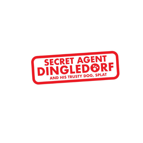
A Brand Style Guide is a document that provides guidelines, typically, for the use of logos, colors, and printed words when writing about your company. As its name suggests, the idea is to stay consistent with the brand identity you wish to create. That way, anyone who prepares materials for your business, whether it’s a social media manager, trainer, copywriter, web designer, or graphic artist, the look and feel of your brand will remain consistent across all platforms.
Carolyn Tomaino provides creative direction and talent acquisition services at CSD Marketing and Consulting. Carolyn knows that a good style guide will make sure that multiple contributors create in a clear and cohesive way in the style of the organization to ensure brand consistency in everything. “It’s like a rulebook for everything that plays a role in the look and feel of your brand. Fonts, styles, colors, logos. It lets everyone know how you want your business to appear to your target audience.”
Creating in the Wild, Wild West
Without a style guide that unifies your look and feel, what happens? Your branding will appear inconsistent and may even appear to be incorrect across various channels. Colors are not quite the same, the logo is slightly different everywhere, and your visual materials, both printed and digital, appear unprofessional. You look like rookies. Or you look like you’ve left a 9-year old explorer in charge. But there is a business case for getting it right. You send mixed messages to your target audience, you confuse would-be followers, and you potentially lose prospective clients.
Cut down on confusion. Promote consistency. Equip your team, both in-house and outsourced, with the tools necessary to get it right. Explain with specificity and granularity so there can be no mistakes. Differentiate between web, print, and video presentations. Carolyn is putting the finishing touches on our style guide as this blog goes to print. I’m sure I’ll have to correct a few things.

Brand Style Guide Essentials
Any brand style guide probably has a few items in common.
Logo variations
You might use your main logo for the website, business cards, letterhead, other important materials, and alternative looks for when your main logo won’t be a good fit. For example, sometimes you need a stencil for black and white, a glass etching look, or a chalkboard background. Perhaps plain black or plain white color makes more sense with these kinds of backgrounds. Let everyone know in advance and provide them with the logo. Make sure you spell out what the logo should be for web and for print, what it looks like stacked or horizontal, in color or monochromatic, how it should be placed, and how much space should be around it.
Fonts for every occasion
When you have too many fonts on your materials, or fonts that aren’t used consistently across channels or platforms, it appears unprofessional. You may want different fonts for headers for web and on print, versus body text on web and print. Fonts and sizes and colors may be different in various circumstances. There may be situations in which you want all caps or italics or bold print, and you’ll want to specify those. And you’ll like want to limit the actual number of different fonts, perhaps no more than 2 to 4, so that your material doesn’t confuse your audience, or look less than professional. Another reason to streamline is so that your Brand Style Guide is simple enough to be implemented correctly.
Color navigation
You’ll want to have a fairly tight set of colors in your palette, otherwise, you will confuse your audience. You’ll want to designate primary and secondary brand colors, the conditions under which you use each, and the precise numeric values for your colors for print, web, and video. The formats may differ. You may also want different colors for headers versus body text.
In other words, leave nothing to chance. As I type this blog, I’m thinking, “I’m free-styling, and the long arm of Carolyn Tomaino is going to come down hard on me with corrections.” So, recognize that a crucial final step in implementing your Brand Style Guide is to make sure that your end-users have a chance to review it and seek clarification before it goes live. And make sure that you revisit the Brand Style Guide as frequently as you review your mission and vision.

Final Thoughts
Our first quarter theme is called “Fresh Start” for a reason. It’s consistent with the concepts of learning and growth, continuous improvement, and lean six sigma. You can make a fresh start today, with a brand style audit that leads to your very own brand style guide. The point is to start somewhere and know that this is just the beginning of your journey towards advancement and progress.
CSD Marketing and Consulting is ready to help you refresh your image and get ready for YOUR closeup. Contact us today!
In the meantime, if you or a loved one is a passionate brick enthusiast like my son and mom, I encourage you to take a look at some of the quirkier facts about our beloved LEGO bricks.